
Imagine you've just started a new role as a Sales Operations Specialist at a bustling tech company. On your first day, your manager points you to the CRM and says, "Figure it out. It's really simple." You log in, and while the interface looks clean, you're faced with dozens of unlabeled icons, five ways to add a contact, and no clear path to your first task – logging a client interaction.
Sounds familiar? This is the difference between something that's merely 'simple' (meaning, lacking complexity) and something that embodies 'enhanced simplicity.' We, as a training team, see this distinction every day when we help people get to grips with new tools. Our goal isn't just to make things look easy; it's to make users feel capable, in control, and genuinely understand the underlying value.
That's exactly what we want for your DoBeacon product tours. This isn't about stripping away features until your product tour is bare-bones. It's about designing a guided experience that reduces cognitive load while actually increasing clarity and competence for your users. By the end of this guide, you'll have a clear framework for building DoBeacon tours that don't just guide, but truly empower.
What Exactly is 'Enhanced Simplicity'?
'Enhanced simplicity' is a concept we lean on heavily. Think of it this way: a single-button remote control for your TV is simple. You press it, the TV turns on. But what if you want to change the channel, adjust the volume, or switch inputs? That single button is now useless, and you're frustrated.
An 'enhanced simplicity' remote, on the other hand, might have just a few clearly labeled buttons – Power, Channel Up/Down, Volume Up/Down, Input. It's still simple to use, but it's enhanced because it provides exactly what you need, when you need it, without overwhelming you with options. It makes the complexity of a TV's functions feel simple to manage.
It's about making powerful tools accessible and intuitive, not dumbed down. For product tours, this means we're not just showing users where buttons are; we're giving them just enough context and explanation so they understand why they're interacting with something, and what positive outcome they'll achieve. Sometimes, a tiny bit more information upfront in a tour step can actually make the whole experience more simple for the user, because it reduces their uncertainty. That might sound counterintuitive, but it's a principle we champion.
Why Enhanced Simplicity Matters for Your DoBeacon Tours
Your product tour is often the very first interaction a new user has with your software. It sets the tone, shapes their perception of ease-of-use, and directly impacts their adoption and retention rates. We often say, "You never get a second chance to make a first impression," and that's especially true here.
DoBeacon gives you incredibly powerful tools to create dynamic, engaging tours – from interactive tooltips. But with great power comes the temptation to show off every cool feature. Resist that urge! Our job is to build experiences that feel like a friendly hand guiding someone through a new space, not a frantic tour guide yelling about every piece of furniture.
Applying 'enhanced simplicity' principles ensures that DoBeacon's capabilities are used to make your product's underlying power clear and easy to grasp, rather than just showcasing complexity. It's about making your users feel smart, not overwhelmed.
Designing for Enhanced Simplicity: A Step-by-Step Guide for DoBeacon
Step 1: Define Your User's First "Aha!" Moment
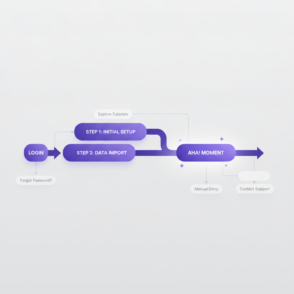
Before you even open DoBeacon, identify the single most impactful thing a new user must accomplish to realize your product's core value. This isn't every feature; it's the specific action that makes them say, "Oh, that's what this does, and I can totally use it!" For a project management tool, it might be creating a project and assigning a task. For a design tool, it could be applying a template and exporting a simple graphic.
This "Aha!" moment forms the backbone of your simplified tour. Everything else can wait for a later, more advanced tour or self-service help content.
Step 2: Strip Down, Then Smartly Add Back
Start your tour design by stripping it down to the bare minimum steps required to reach that "Aha!" moment. Cut anything that isn't absolutely essential. Once you have this skeletal tour, then – and only then – begin to strategically reintroduce elements that enhance the simplicity.
This 'adding back' isn't about more steps, but about adding brief, helpful context. For example, instead of just a tooltip pointing to a button, your DoBeacon step might say, "Click 'New Campaign' to start building your first email sequence. This is where your marketing magic begins!" The second sentence adds a touch of motivation and context, making the interaction more meaningful and thus, simpler to understand why it's important.
Step 3: Craft Micro-Interactions with Macro-Clarity
Each step in your DoBeacon tour should be a bite-sized, digestible piece of information. We're aiming for micro-interactions that contribute to a macro-understanding. Use clear, concise language. Avoid internal jargon or acronyms that a new user wouldn't understand.
DoBeacon allows you to use various elements like tooltips, modals, and spotlight steps. Choose the right one for the job: a tooltip for a quick explanation of a field, a modal for a crucial decision, or a spotlight step to highlight a non-interactive element that provides important context. The key is that each interaction should feel natural and flow logically to the next.
Step 4: Provide Clear Escape Routes & On-Demand Support
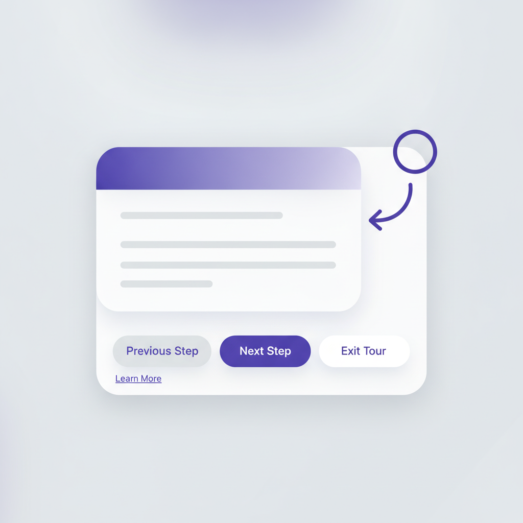
Even the most perfectly designed tour might not be right for every user at every moment. Enhanced simplicity also means empowering users to control their learning journey. Make sure your DoBeacon tours always offer clear options for users to control their experience, such as exiting the tour gracefully.
Furthermore, think about linking to deeper resources from within the tour steps. If a user wants to understand more about a specific feature, a small "Learn More" link (to your help documentation or a specific video tutorial) keeps the main tour path clean while providing an avenue for those who desire deeper context. This is where DoBeacon's integration capabilities truly shine.
Step 5: Test, Observe, Iterate for True Simplicity
We can design what we think is simple, but the true test comes when real users interact with it. We strongly recommend testing your DoBeacon tours with actual new users. Watch where they hesitate, where they click outside the tour, or where their eyes wander. Ask them open-ended questions like, "What did you expect to happen there?" or "What are you trying to accomplish right now?"
The insights you gain will be invaluable. You might find that a step you thought was perfectly clear is actually a major stumbling block, or that a seemingly minor addition to your text drastically improves understanding. Use this feedback to iterate and refine your tours. This continuous improvement process is how you achieve genuine 'enhanced simplicity'.
Building Truly Intuitive Experiences
Designing for 'enhanced simplicity' in your DoBeacon product tours isn't just a design philosophy; it's a commitment to your users' success. It's about empowering them to quickly grasp your product's value and feel confident using it, without overwhelming them with unnecessary complexity.
We hope this guide gives you a solid framework for building those kinds of intuitive, impactful experiences. To help you apply these ideas immediately, we've put together a handy checklist for designing your next DoBeacon product tour, ensuring you hit all the marks for enhanced simplicity. You can download it here: [Link to hypothetical downloadable checklist].
And if you're ready to start building those intuitive experiences, you can explore DoBeacon for yourself at https://dobeacon.com/signup.