
Imagine this: a new user signs up for your product, excited to get started. They're greeted by a product tour, but instead of helping, it feels like a marathon. Click next, next, next... and by the end, they're more confused than when they began. Sound familiar? We've all been there, both as users and, perhaps, as the well-meaning designers of those tours.
The truth is, simply making something "easy to use" isn't enough anymore. In a world saturated with apps and platforms, our users expect more than just simplicity; they crave Enhanced Simplicity. It's a concept we spend a lot of time thinking about here, because it's the difference between a user who quickly understands and loves your product, and one who churns out of frustration.
What Exactly Is 'Enhanced Simplicity'?
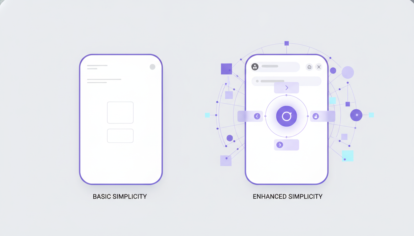
At its core, enhanced simplicity isn't just about stripping away features or making things look minimal. That's basic simplicity, and while it has its place, it often leaves users wanting more, or worse, unable to find what they need. Enhanced simplicity is about intelligently managing complexity so that the user experiences something truly simple, even if there's sophisticated logic working behind the scenes.
Think about a high-end camera. On the surface, it might have a simple dial for automatic mode. But under that dial, there's an incredibly complex system of sensors, lenses, and algorithms working together. The user isn't exposed to that complexity; they just get a great photo with a single turn of a dial. That's enhanced simplicity. For product tours, it means guiding users fluidly without overwhelming them, making the complex seem effortless.
Why Product Tours Need This Framework More Than Ever
Your product tour is often the very first interaction a new user has with your software. It sets the tone, builds confidence, or, unfortunately, creates friction. A tour built with enhanced simplicity in mind doesn't just show users where things are; it helps them understand why they'd use them, and how to achieve their goals quickly. The best product tours don't feel like tours at all; they feel like seamless, intuitive interactions that just make sense.
When we onboard new team members or run product walkthroughs, we always start by asking: "What's the absolute first success metric this user needs to hit?" Not "What are all the features we need to show?" This distinction is vital. Enhanced simplicity focuses on enabling that initial success, then gently revealing more as the user grows.
Deconstructing the Journey: Start with User Goals, Not Features
Before you even think about pop-ups or tooltips, take a step back. Who is your user? What job are they trying to get done when they sign up? A new marketing manager using a project management tool, for instance, isn't looking to understand every single report type on day one. They likely want to create a new project, assign a task, and see its due date. That's it.
We often find that product teams get so caught up in showcasing every brilliant feature they've built, they forget to let the user breathe. Your enhanced simplicity framework starts by identifying those core, 'aha!' moments and designing a path directly to them. This often means not showing things you're proud of, at least not yet. It’s a bit counterintuitive, but sometimes, to make something truly simple, you have to build something complex under the hood – like smart routing for tours – that users never even see.
Strategic Concealment: The Art of Progressive Disclosure
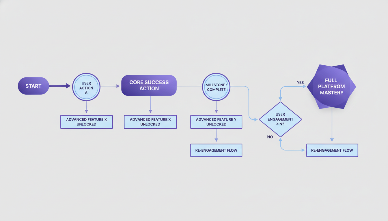
Once you know the core goal, the next step is strategic concealment. This is the 'enhanced' part of our framework. It means you don't reveal every button, every menu item, or every advanced setting all at once. Instead, you progressively disclose information and functionality as the user needs it, or as they complete initial tasks.
Think about how a seasoned chef uses a complex kitchen. They don't pull out every single utensil or ingredient at the beginning. They start with what's needed for the first step, then progressively add more as the recipe unfolds. For your product tour, this might mean: don't show the advanced analytics dashboard until a user has created their first three reports. Don't highlight integration options until they've successfully used the core functionality for a week. This reduces cognitive load significantly and makes the learning curve feel less steep.
Contextual Guidance: The Right Information at the Right Time
Generic, linear tours are the enemy of enhanced simplicity. A tour built on this framework is dynamic and responsive. It understands where the user is, what they've done, and what they're trying to do next. If a user is struggling to upload a document, the tour should offer guidance specifically for document uploads, not a generic "here's the settings menu" tooltip.
We often see this fail when companies try to build one-size-fits-all tours. But a sales manager needs a different tour experience than a sales rep, even if they use the same CRM. Their goals are different. Their initial 'aha' moments are different. Contextual guidance means delivering personalized paths based on user roles, past actions, or even the data they've already entered. It's like having a helpful co-pilot who knows exactly what you're trying to achieve.
Feedback Loops and Iteration: Simplicity Isn't Static
Enhanced simplicity isn't a set-it-and-forget-it deal. User needs evolve, products change, and new features are added. Therefore, your product tour framework needs robust feedback loops. Are users dropping off at a specific step? Are they skipping certain parts of the tour? Are they taking too long to complete a core task?
Gathering this data – through analytics, user interviews, and A/B testing – is essential. We've often discovered that what we thought was a simple path was actually causing confusion for a specific segment of users. Iterating on your tours, making small, data-informed adjustments, ensures that the 'enhanced simplicity' you're aiming for remains genuinely effective over time. It's a continuous process of refining and polishing the user's journey until it feels truly effortless.
When you build your product tours with enhanced simplicity in mind, you're not just making things easier; you're creating an experience that fosters genuine understanding and long-term engagement. It's about empowering your users to achieve their goals with grace and confidence.
Ready to put these principles into practice? Download our free 'Enhanced Simplicity Product Tour Checklist' to start applying these ideas to your onboarding today. It's packed with actionable steps to help your users fall in love with your product from day one. And if you're looking for a platform that makes building these intelligent, user-centric tours a breeze, you can always explore what DoBeacon offers at https://dobeacon.com/signup.